Windows 11 ships with a new File Explorer, and here's everything you need to know about the experience.
Microsoft is finally shipping an updated version of File Explorer with the release of Windows 11. The app still retains the same familiar design as the legacy version, but with new visual elements and tweaks making it the major update in many years.
The new File Explorer is based on the Windows UI Library (WinUI), which provides new styles and controls to rejuvenate the visuals and animation of applications for Windows 11. As a result, we are getting a file manager that features a clean and simplistic interface with a new command bar, new icons, and many improvements.
In this Windows 11 guide, we will show you all the improvements and tweaks available in the new version of File Explorer.
The modern File Explorer
The new File Explorer does not include tabs, but there are a lot of changes, including a new modern interface, icons, redesigned context menu, and many other tweaks.
In this new version, the interface features a skin that matches the design language that Microsoft is pushing across Windows 11 with rounded corners and a base layer that uses the Mica material, an element that lets the background shine through the app that does not affect performance or battery life and falls back to a solid color when the app is not in focus. And now, the menu and the title bar have been combined into one header interface.
File Explorer also ditches the ribbon-style menu in favor of a new command bar that has new icons, including for Cut, Copy, Paste, Rename, Share, and Delete, which, interesting enough, no longer feature labels. This should not be a problem for most users, but it could make it a little harder for some people to distinguish the button's action.
On the left side, that's where the "New" menu is located, which includes the options to create a new folder, shortcut, or document. As a result of this implementation, you will no longer find the option to create a new folder in the command bar, but you still have two choices, including using the "New" menu or the "Ctrl + Shift + N" keyboard shortcut.
Since the ribbon with tabs is no longer a thing, the file manager is using three new drop-down menus, including "Sort and group options," "Layout and view options," and "See more" to house the remaining options.
The Sort (Sort and group options) menu includes the options to sort content by name, date modified, type, and more.
The View (Layout and view options) menu is where you will find the options to show items in different sizes, such as extra-large, large, small, list, details, and more. The menu also has the option to enable the compact view instead of the new view with more padding around the items in the app. In addition, the Show submenu houses the options to manage the left pane view, show or hide extensions, or hidden items.
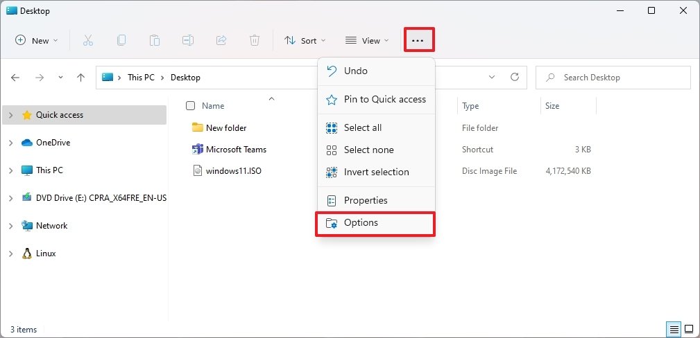
Finally, the three-dotted icon on the right side is for the "See more" menu that includes the commands for selections, compressed to ZIP file, and Options to manage the app settings.
Similar to the legacy version of File Explorer, the options in the command bar will change according to the content you are viewing, meaning that depending on where you are and the files you are managing, you will see different commands. For example, the "New" menu won't be available on the "This PC" page, but the "See more" menu will include the options to manage network locations and map network drives.
Also, when selecting an image or zip folder, you will get related options to manage those files.
New icons
On Windows 11, File Explorer introduces modern icons with new styles, colors, and orientations to align with the latest design changes.
The icons are available across the app, but the most noticeable designs are available for the profiles folders, including Desktop, Documents, Downloads, Music, and Pictures. Also, the "New folder" icon has been updated, and this time around, there are two versions of the icon, one to indicate the folder is empty and another one that indicates the folder has content. Microsoft even includes a new icon for zipped folders.
Alongside the profile folder icons, you will find new icons for system drives, including the installation drive, secondary and network drives, and many other elements, such as options like This PC, Network, items in the menu, and inside the "Folder Options" settings.
Redesigned context menu
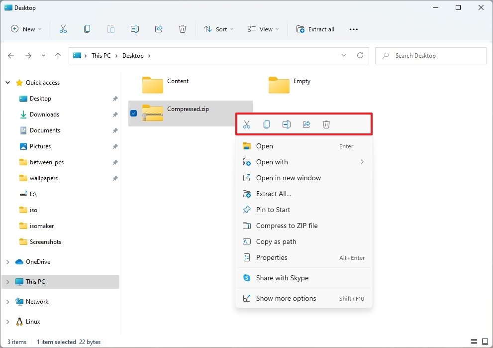
The updated file manager also comes with a new context menu design. When you right-click an item, or inside a folder, you will get a new menu that includes a top row with commands for quick action like Cut, Copy, Rename, Share, and Delete, and then a list of options depending on the item you are selecting.
Following the same design language approach on Windows 11, the new context menu interface includes rounded corners, semi-transparent background, and consistent and straightforward iconography for each action.
The new menu only includes the most common commands, but if you need other options, you can always use the Show more options item (Shift key + F10) to open the classic menu with all the legacy options.
Although we highlight the new context menu style in File Explorer, it's also available for the Desktop and across the experience.
New scrollbar
In this update, Microsoft is also trying to modernize the legacy scrollbar by making it a little more minimalistic, and it's the new design you will see across all the remaining legacy elements.
WSL integration
File Explorer also integrates the Windows Subsystem for Linux to the experience by adding the ability to access Linux files with a new option in the left navigation pane.
As you select the Linux entry on the left, you will have access to all the distros installed on the computer, and accessing each distro will place you at the root directory of that distribution.
New Share experience
In the new version, you will also find an updated Share experience. When you click the Share button, the new interface shows the icon alongside the name and number of items you are about the share.
If "Nearby sharing" isn't enabled, you can turn it on directly from the interface, and there is a button to select other contacts or apps if they are not in the list of suggestions. Also, there is an option to access the Nearby sharing settings page at the bottom of the page.
Settings
Although the updated version of File Explorer includes a slew of cosmetic changes, the overhaul does not expands across the experience. For example, by accessing the "Folder Options" from the "See more" menu, you will see the legacy interface. The experience does include a few tweaks like rounded corners for buttons and corners and some new icons, but everything is still virtually the same as before.
You can find a lot of parts that haven't really changed. You can see this in the properties page for drives, the Format tool, and the wizard to map a network drive on Windows 11.
Other changes
When searching, it's now possible to remove previous searches by right-clicking the entry and selecting the "Remove from device history" option or clicking the X button.
If you use OneDrive, you will now have the "Extract All" option when right-clicking a zipped folder that was previously configured as online-only.
In addition, when right-clicking a PowerShell script (.ps1), you will now see a Run with PowerShell option in the context menu.
On Windows 11, when renaming files and folders, you can use the CTRL + Left and Right arrow to move the cursor between words in the name and CTRL + Delete and CTRL + Backspace to delete words at a time.
Wrapping things up
Although we are getting a new look and feel for File Explorer, this is still the same application but with a different skin. You can quickly notice this as many elements continue with the legacy appearance, and many features haven't changed.
Also, it might be just me, but the new design might end up impacting productivity. If you don't consider yourself a tech-savvy person and relied on the ribbon menu, the settings and tasks will be a little more challenging to find. For example, the option to create a new folder now takes extra steps, there are no labels for common task commands, and the settings page to configure experience is a little more buried than before.
More Windows resources
For more helpful articles, coverage, and answers to common questions about Windows 10 and Windows 11, visit the following resources:


0 comments:
Post a Comment