App snapping is getting a few new features and functions on Windows 11.
What you need to know
- Microsoft is updating the snapping UX on Windows 11.
- There's a new drop-down menu and more snapping grids.
The leaked Windows 11 build has given us a fascinating look into some of the new user experiences Microsoft is building for its next generation of Windows. One area that Microsoft is improving is in window snapping and multitasking, a staple part of the Windows UX that has remained much the same since Windows 7.
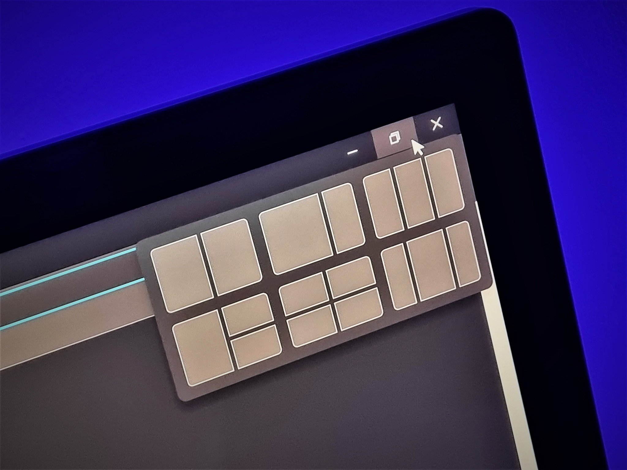
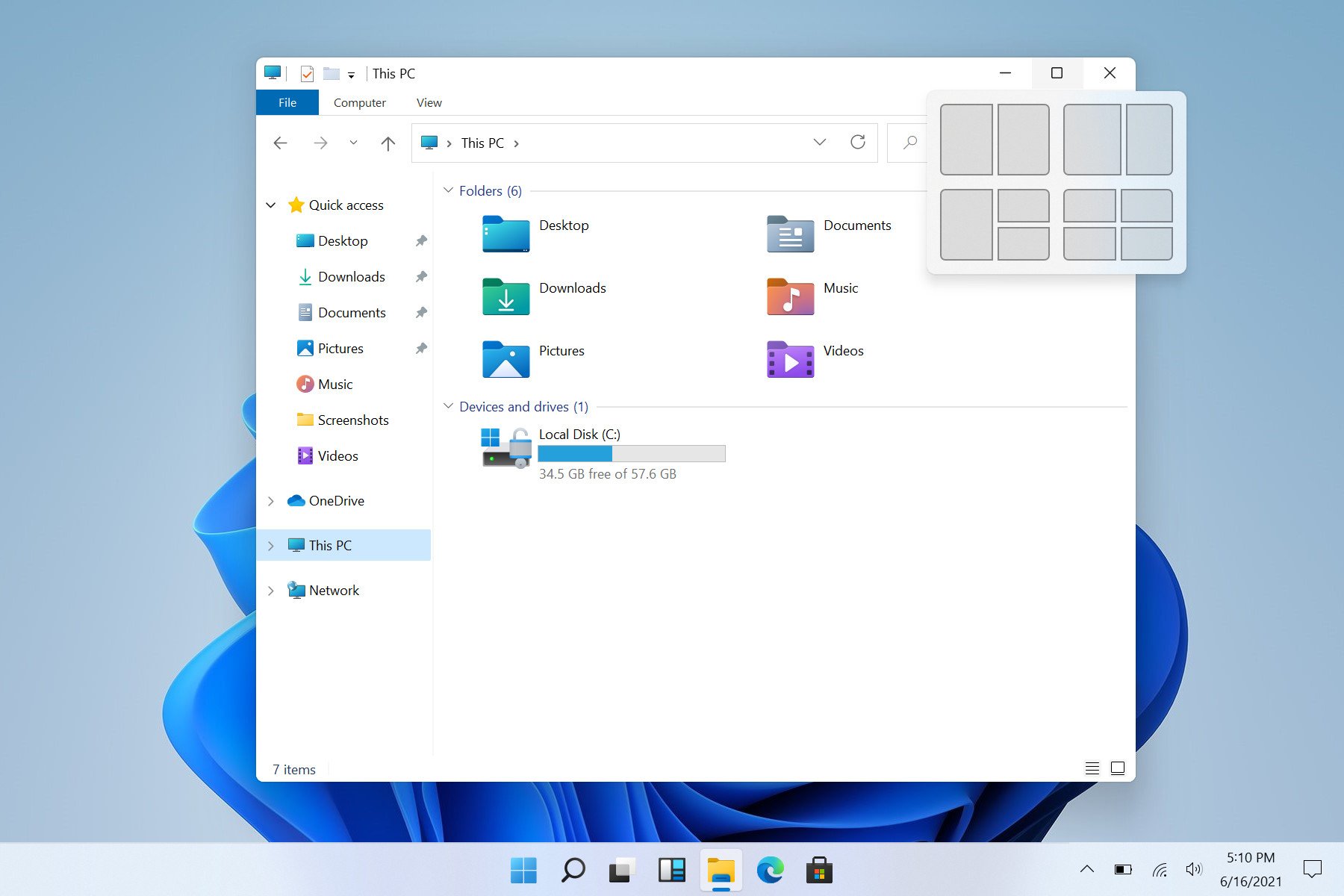
On Windows 11, Microsoft is adding some nice additions to the snapping UX. To begin, there's a new super handy snapping grid menu that drops down when a user hovers their cursor over the app window maximize button.
This drop-down menu allows you to snap the app you're using to a particular position in one of the grid layouts that Microsoft has built into Windows 11. On small screens, you get four layouts to choose from, totalling in 11 different snapping areas to select. On devices with a large display, you get an additional two layouts which totals to 17 different snapping areas to select.
Clicking on any of the selected snapping areas will automatically resize and snap your window to that area. You can then go ahead and snap all the other apps where you like, or follow the guided snapping layout that the dropdown menu recommends. I really like this new drop-down menu, as I think it makes the snapping functionality much more discoverable.
Unfortunately, I've found that not ever app window supports the drop-down menu. Apps like Spotify and Slack, which use their own window controls, don't (yet) know to initiate the snapping menu. Hopefully this changes as app developers who aren't already using native window controls jump on board.
You can still manually snap all apps side by side or in a quadrant by dragging the app window to the edge or corners of the display, and devices with larger displays can also now drag and snap three apps side by side. The drop-down menu makes snapping as a whole more discoverable to users who may not know it's a thing you can do.

Microsoft has also updated the behavior of snapping when in the portrait orientation. On previous versions of Windows, it wasn't possible to snap apps top and bottom, only side-by-side. On Windows 11, Microsoft has finally added this ability. When a display is in portrait mode, Windows will automatically position apps above and below when initiating snap.
This is super useful on tablets and desktop PCs that may have external monitors set up in the portrait orientation. Snapping is now useful, as Windows will no longer try to snap them side-by-side on a super narrow setup.
Windows 11 supports top/bottom app snapping when in portrait mode. Finally! pic.twitter.com/KwirSf3yIN
— Zac Bowden (@zacbowden) June 15, 2021
Microsoft has also improved the memory of snapped apps. If you have a snapped layout in horizontal mode and you rotate your display, Windows will rotate those app windows and keep them in their snapped positions. It'll also remember snapped window positions when you dock and undock from external monitors.
Overall, these improvements to the snapping UX on Windows 11 are very welcome, and are a great productivity booster for those who find themselves constantly manipulating multiple app windows at a time. What are your thoughts on these new Windows 11 features so far? Let us know in the comments.


0 comments:
Post a Comment