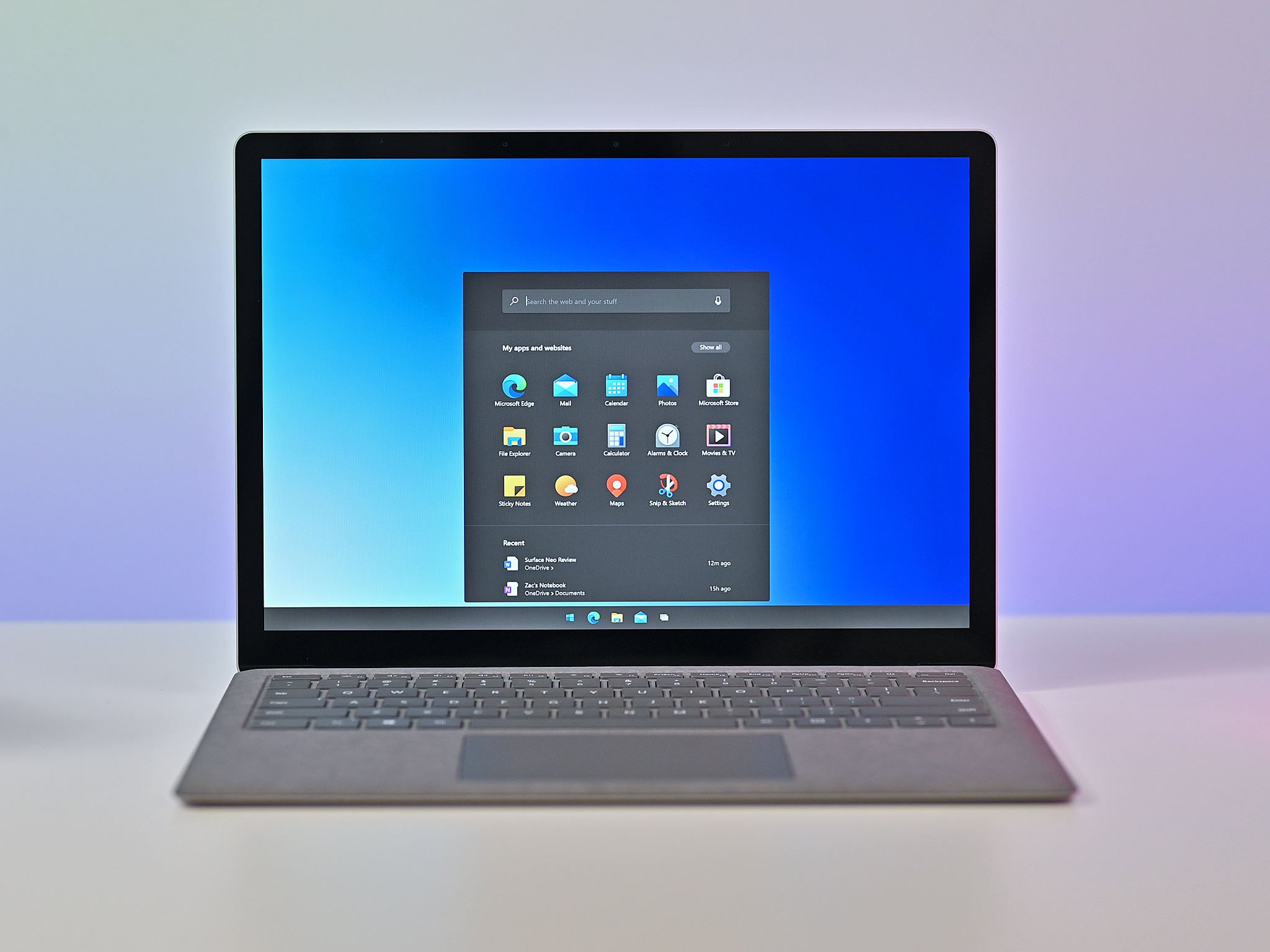
I'm enamored with Windows 10X, and it took seeing just one feature to do it.
Like many of you, I jumped at the chance to see our executive editor Zac Bowden go hands-on with Windows 10X. We've seen screenshots and snippets of Windows 10X and even had an emulator to play with, but this latest video shows it off in 60FPS glory.
While I love the look of Windows 10X as a whole, one feature stuck out to me, its new flyout menus. Microsoft moved many of the system tray shortcuts into the quick actions menu. Not only do these look great, but they improve the functionality of the quick actions menu and make it much easier to control aspects of your PC.
Bowden actually showed off the Action Center on Windows 10X almost a year ago but seeing it in this latest video just got me excited.
It's just gorgeous
Maybe it's weird to think an operating system is gorgeous, but it is what it is. Like many people with desk jobs, I look at a screen running Windows 10 all day. I also study apps and elements of Windows 10 as part of my job, so inconsistencies and weird design choices bug me. The improved quick actions menu on Windows 10X and the flyouts within it just look great.
They don't look like a combination of elements spanning across the greatest hits of Windows. They were built fresh, and it shows. When you use Windows 10, it clearly isn't as new and fresh as an OS like iPadOS. From what we've seen from Windows 10X so far, that gap seems to have sizably shrunk.
Not just about looks
If you jump to the 3-minute mark of the video, you'll see the new quick actions menu in, well, action. The system tray controls for some important items have jumped into the action center, and Microsoft added flyouts to easily control the device.
To me, this new feature is what Windows 10X is all about. It looks great. It fits the new design language Microsoft is shooting for. And most importantly, it actually adds something to the device. While I like that Microsoft has finally updated the volume control UI, a leftover element that I believe is from Windows 8, it still works. It just looks bad while doing it.
The updated quick actions menu improves the functionality of the device. While you can control some elements of Windows 10 directly from the system tray, a lot of the time, clicking on things jumps you over to the Settings app. This works, but it takes extra time. Also, it doesn't feel very modern, at least not to me. When you have to jump through multiple menus and go to a separate app to actually perform a task, it feels like the feature is an afterthought.
It's worth pointing out that Windows 10 lets you change some things directly from the system tray, such as selecting a Wi-Fi network, but the interface on Windows 10X adds more options.
A new type of Windows
I can honestly say I haven't been this excited about Windows in years. Microsoft has a vision for a modern Windows, and it appears that Windows 10X is checking the boxes. I can't wait to get my hands on it, and I can't wait to see how it develops in the future.


0 comments:
Post a Comment