UI enhancements, a new browser, and more. Here's our review.
Microsoft's next big Windows 10 feature update is almost here, packing several notable changes and enhancements. This release is known as the October 2020 Update, version 20H2, and is the second big Windows 10 update to hit in 2020, after version 2004 which released in May earlier this year. This release is very much a continuation of version 2004, adding a few final touches and subtle design tweaks, cleaning up the UI.
20H2 will be delivered as a free cumulative update that sits on top of version 2004, meaning the update will only be a few hundred megabytes and won't take long to install. If you're on version 1909 or below, version 20H2 will be delivered as a free full OS upgrade. In this review, we'll be looking at all the notable new changes and improvements, good or bad.
- Video walkthrough
- Start menu and Notifications
- Settings
- Tablet Mode
- Microsoft Edge
- Miscellaneous
- Conclusion
October 2020 feature update
Microsoft Windows 10
Bottom line: The October 2020 Update (version 20H2) brings polish and improvements to Microsoft's OS, including a refreshed Start menu design and the new Microsoft Edge which is now bundled.
Pros:
- Start menu design is great
- UI tweaks are welcome
- New Microsoft Edge included
Cons:
- Tablet Mode changes aren't great
20H2 video walkthrough
Prefer your content in video form? Check out our 10-minute video guide showcasing all the notable new changes in this release of Windows 10.
Windows 10's Start menu and Notifications
The Start menu on Windows 10 is the area that has seen the biggest changes, even if rather subtle. In fact, you may not notice anything has changed, unless pointed out. With version 20H2, Microsoft has started tidying up the Windows 10 UI, and the Start menu is our first port of call.
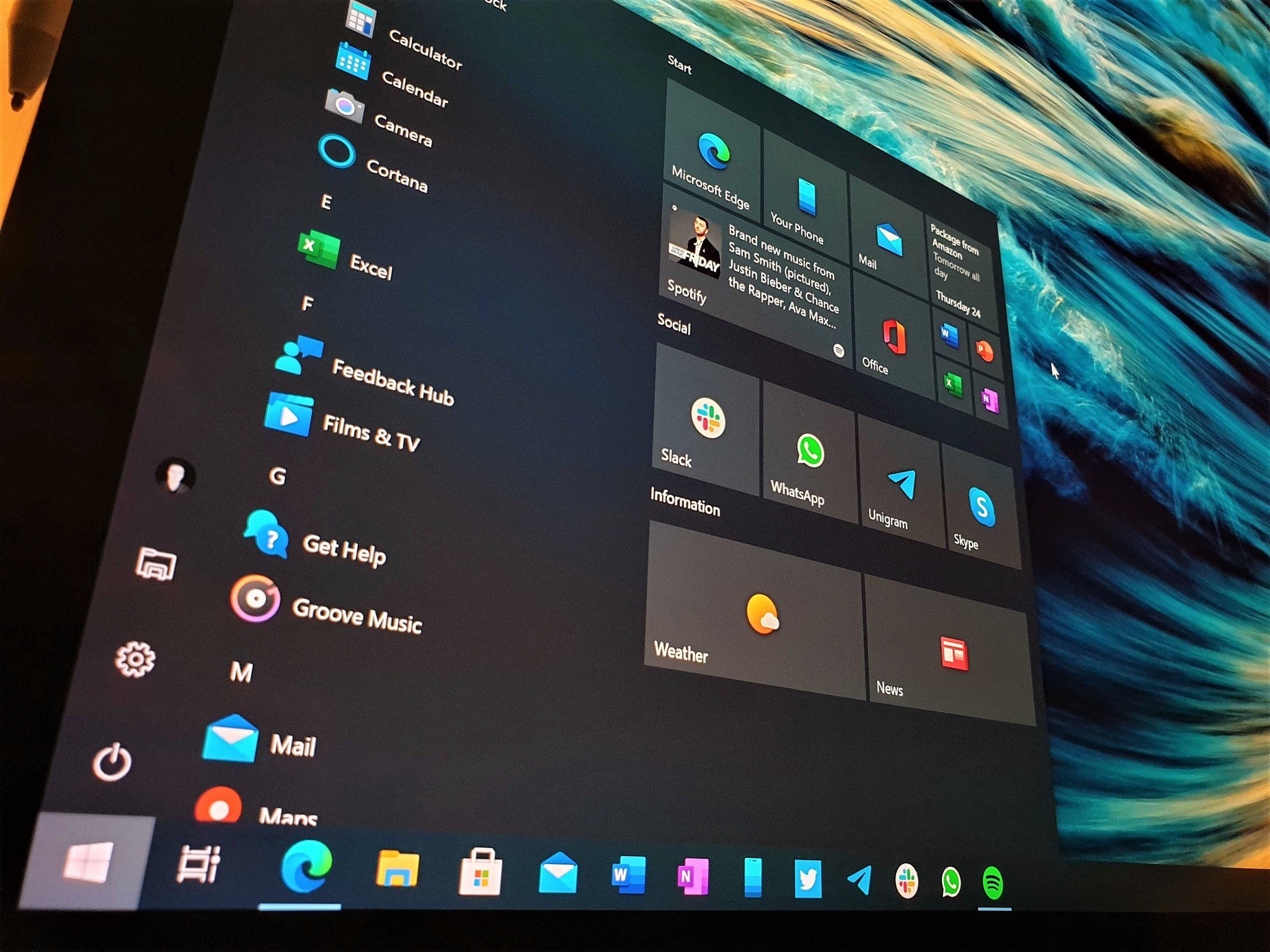
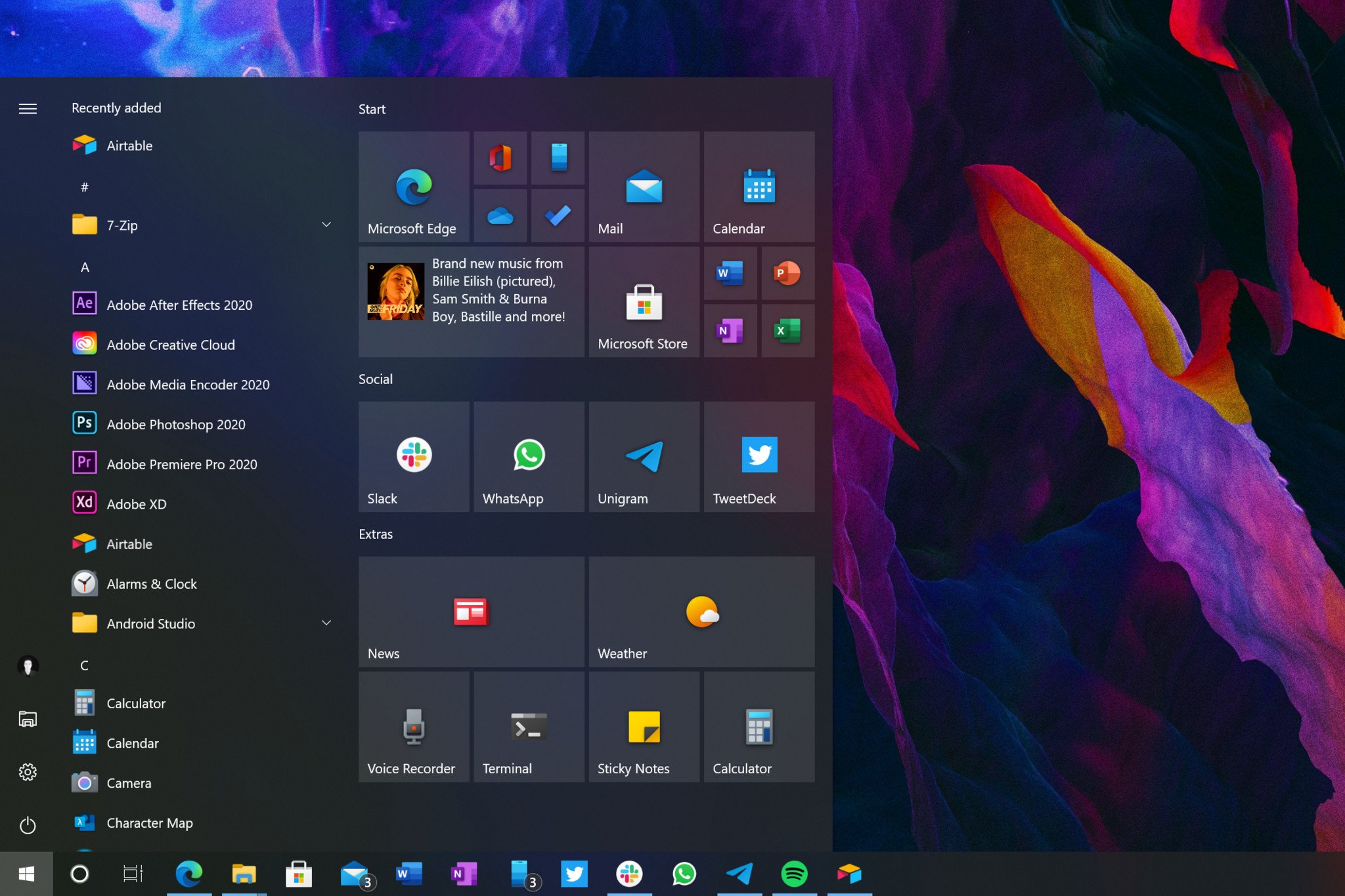
The live tile interface is now system theme aware, with tiles no longer following your chosen accent color. This introduces a minor change that's designed to keep the Start menu interface looking minimalist. Instead of following your accent color, the live tile interface now matches your system theme. So, if you're using Windows 10 in light mode, the tile interface will reflect that.
These UI improvements are a welcome change to Windows' stagnant design.
In addition to the tile color matching your system theme, the tiles themselves are now also slightly translucent, allowing your wallpaper or app content behind the Start menu to blur through the tile interface. Again, it's a subtle design change, but one that I think really makes the Start menu look modern.
Elsewhere in the Start menu, Microsoft has removed the accented squares behind app icons in the apps list. Now, the apps list just shows app icons without a square backing plate. This further adds to the minimalist setup Microsoft appears to be going for with this updated Start menu design. It makes the new colorful icons that were introduced earlier this year really pop.
I'm so happy that Microsoft is finally focusing on Windows' design starting with this release. It's only a small amount here, but I really hope this is a sign of things to come for Windows 10. Windows' UI has stagnated in the last few years, and with platforms like macOS delivering full-blown UI redesigns, Windows really needs a refresh. Hopefully we'll see more of this in 2021.
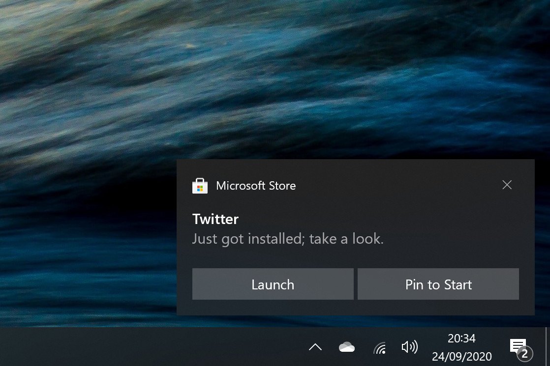
Version 20H2 also shakes up popup notifications, which have received a very minor face lift to bring their design in-line with the notifications found on Microsoft's upcoming Windows 10X operating system. This isn't a huge change, but a few things have moved around a bit to provide a bit more of a clean design.
Elsewhere, Microsoft has adjusted the behavior of Focus Assist so that it'll no longer notify you of things you missed when Focus Assist is enabled. You can re-enable this function if you like it, but many will find it annoying, over checking the Action Center themselves upon disabling Focus Assist mode.
Windows 10's Settings
As is the case with every Windows 10 feature update, Microsoft has continued to bring over legacy Control Panel settings to the modern Windows 10 settings app. With version 20H2, Microsoft has ported over the ability to change your display's refresh rate inside the Settings app.
Elsewhere in the Settings app, Microsoft has added copy buttons to the System Properties area, which allows you to copy all device information to your clipboard in one-click, which is handy if you're trying to send a support rep your device details.
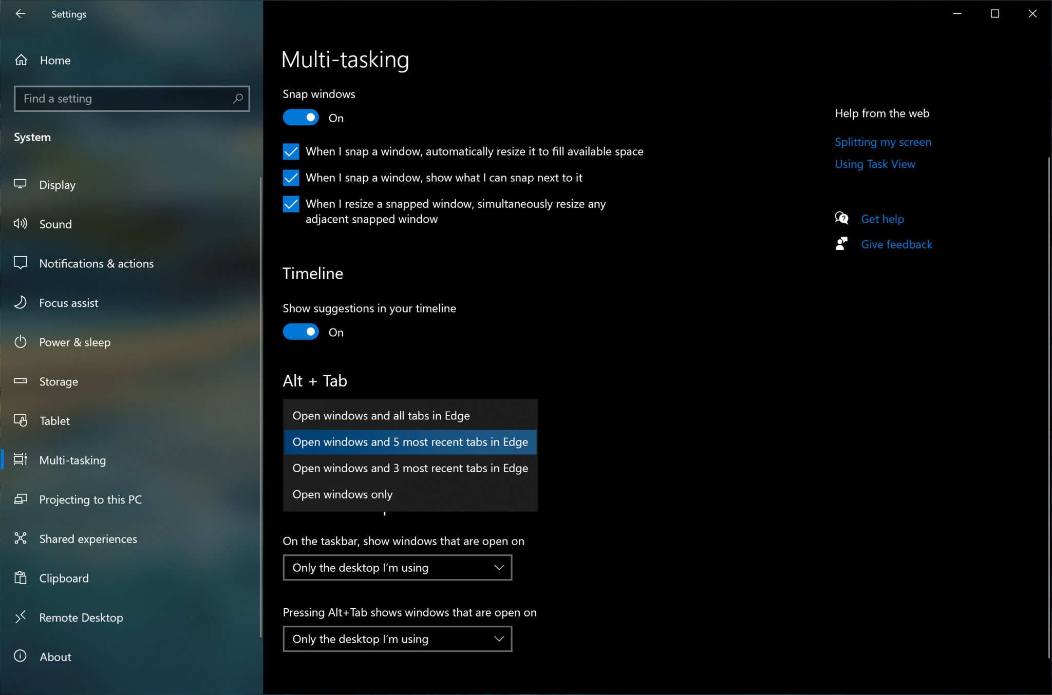
In this release, the ALT+TAB interface will now show your open Microsoft Edge tabs too. This can be configured in the Settings app, with choices of showing all open tabs, the last five tabs, the last three tabs, or no tabs. In previous versions of Windows 10, tabs open in Edge didn't show up in this interface at all.
Windows 10's Tablet Mode
Windows 10 Tablet Posture (left) | Windows 10 Laptop Posture (right)
One big change that is shipping as part of this release is a change in the way Windows detects and responds to switching between laptop mode and tablet mode. In the past, a convertible Windows laptop would switch from normal desktop mode to Windows 10's "Tablet Mode" when detaching or flipping around the keyboard. With version 20H2, that's no longer the case.
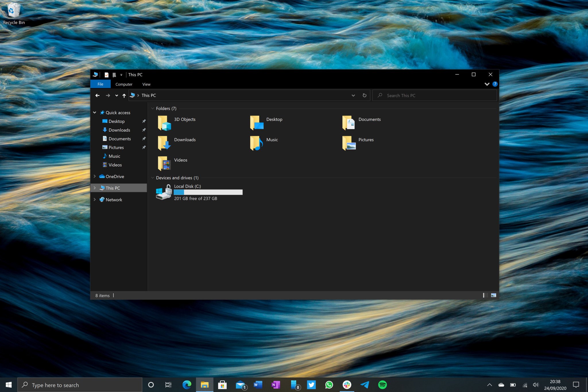
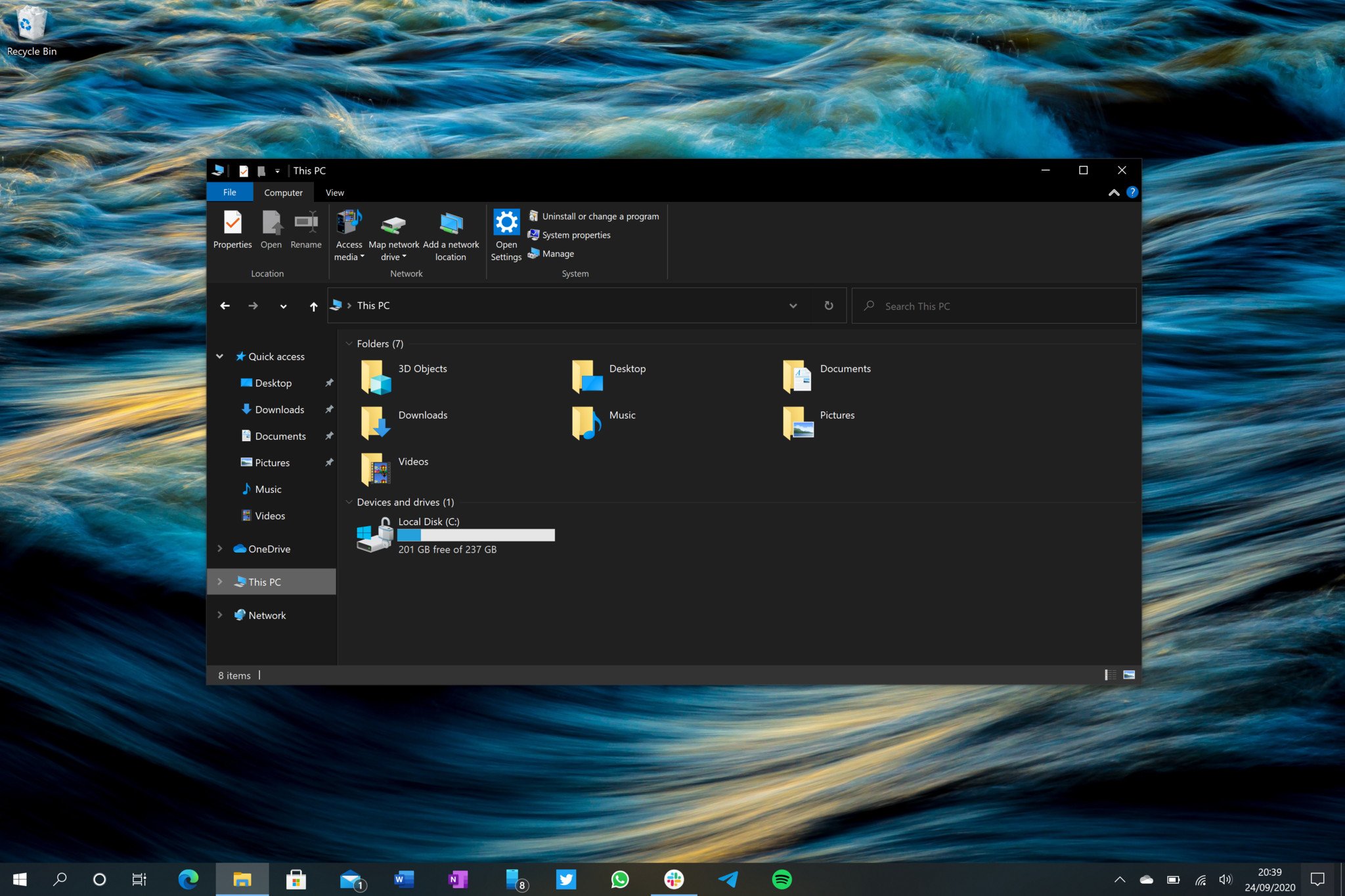
In this release, when a user changes postures from laptop to tablet, Windows will instead adjust the desktop interface to be a little more touch friendly. The search bar on the taskbar will collapse, pinned and running apps will be more spaced out, the touch keyboard icon will appear in the system tray, and the File Explorer will adopt larger hitboxes.
Tablet Mode isn't "improved" with these changes.
The Start menu won't go full screen, and apps remain in app windows, and won't open full screen either. The old Tablet Mode would maximize the Start menu, turning it into a Start Screen, and force all apps to run in full screen like you would expect on a tablet. This behavior is no longer default with version 20H2.
It's unclear exactly why Microsoft has made this change. The new tablet experience is not an improvement over the old one. That's not the say the old Tablet Mode was any good, but the changes made here aren't any better. Microsoft still needs to deliver a truly new and innovative Tablet Mode experience to match iPad. Simply put, it's not there yet.
For those that don't like the new tablet posture changes, you can go into Settings and re-enable the old behavior that automatically put you into the dedicated Tablet Mode with fullscreen apps.
Microsoft Edge
This addition in version 20H2 might not be notable to some, as Microsoft has been slowly rolling out the new Edge via Windows Update to older versions of Windows 10 for a while. However, if you haven't yet manually downloaded or automatically received the new Microsoft Edge on your PC, this new version of Windows 10 now comes with it preinstalled.
The new Microsoft Edge is great. From a web browsing and performance standpoint, it's an improvement over the previous version of Edge in every way. It's missing some of old Edge's unique features, including Set Tabs Aside and inking directly onto webpages, but usage of those features was low to begin with.
The new Microsoft Edge is worth a try, even if you don't want it.
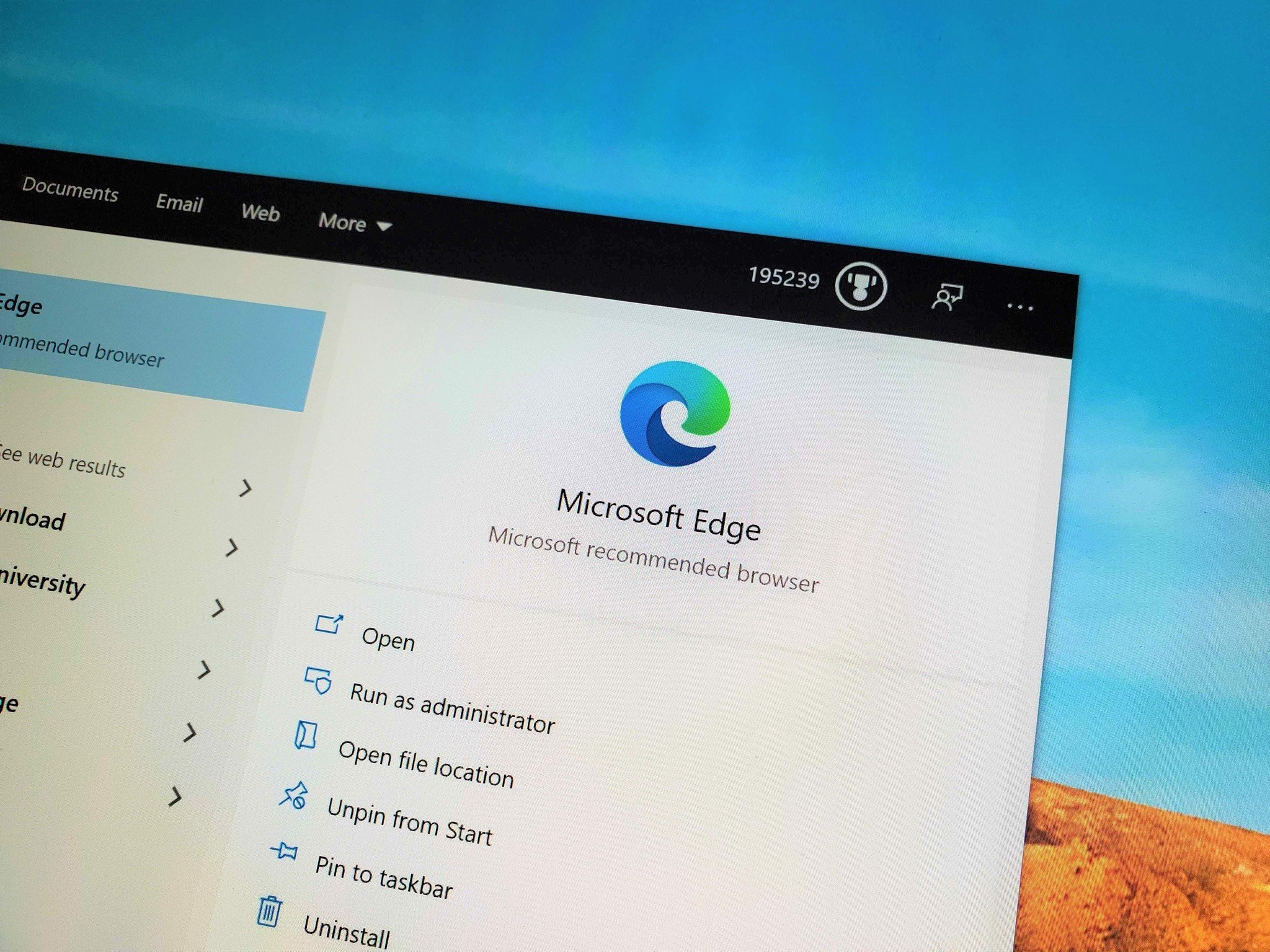
With the new version of Edge comes a new user interface and icon, which sits nicely in the taskbar alongside Microsoft's other new icons introduced throughout the year. If you'd like a deep dive into what's new with the latest Microsoft Edge, make sure to check our full review.
Those of you who don't use Edge, this will still be automatically installed when you update to version 20H2. That's because this new Edge outright replaces the old Edge with this release of Windows 10. And just like how you couldn't uninstall the old Microsoft Edge before, you can't uninstall the new Microsoft Edge, either. You can't uninstall Safari on macOS or Chrome on Android, and it's a similar case here. Edge is there as a backup if you don't want to use it as your primary.
I do think you should give the new Edge a try, however. It's based on Chromium, the same technology that powers Google Chrome and Opera. If you like Chrome, you'll likely feel the same with the new Edge.
Miscellaneous
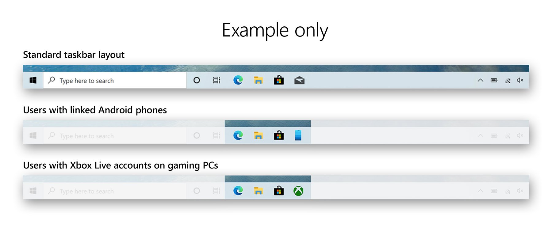
For new PCs shipping with version 20H2 preinstalled, the taskbar will now be semi-customized to your account when you hit the desktop for the first time. Microsoft will analyse your Microsoft Account and determine whether to pin certain apps to your taskbar by default. For example, if you have an active Office subscription, it'll pin the Office app to your taskbar for you. If you have an Android phone linked to your account, it'll pin the Your Phone app for quick access.
It's a minor change, but one that I think some people will appreciate. You can easily unpin any additional apps it decides to pin, once you land on the desktop. This only applies to new PCs with version 20H2 preinstalled. This behavior won't happen just by updating your existing PC.
Conclusion
Those are all the notable changes coming in the Windows 10 October 2020 Update. It's a minor one, for sure. The UI improvements are welcomed and hopefully a sign of things to come. Windows 10 is in dire need of a refresh, and perhaps we will see that happen in 2021.
The Windows 10 October 2020 Update is scheduled for a October rollout, and if you're running version 2004, it'll be a simple patch that won't take long to install. I recommend updating when possible, as it's really designed to make Windows look and feel better. The big changes to tablet mode can be reverted if you don't like them, so little reason to not update.



0 comments:
Post a Comment