Check out the new Start menu, notifications, and more on video!
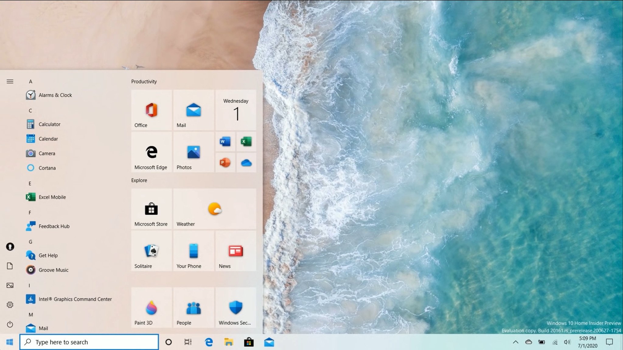
Yesterday, Microsoft released a new build of Windows 10 that includes an updated Start menu design with translucent Live Tiles, improvements to Notifications, and behavior changes to things like Tablet Mode and the Taskbar. It's been a while since Microsoft released a build with any surface-level changes, but now it's finally happened, we're back showcasing all the changes on video.
The new Start menu is just the beginning of some of the UI changes Microsoft is planning to make to Windows 10. It's not a huge change, but it makes all the difference. In the past, the Start menu was a messy looking UI, but with these changes, the Start menu Live Tile interface looks uniform and minimalist.
Now, not every app abides by these new translucent designs, but most of Microsoft's in-box apps do. Over time, this will improve. It's pre-release right now, and honestly a great first look at the work Microsoft is doing to Start. Notifications are also receiving a minor UI update, with an X for dismissing notifications instead of an arrow.
Microsoft is also experimenting with different Taskbar layouts when settings up a PC for the first time, depending on whether your Microsoft Account has an Android phone or Xbox LIVE account linked to it. If it does, you might see the Your Phone or Xbox app pinned to the taskbar by default.
Make sure you check the video out for all the biggest changes and let us know in the comments what you think!


0 comments:
Post a Comment